
Data Filtration
To filter the mast data, two methods are provided: automatic and manual filtration.
-
Click the expand icon
 beside Data Filtration.
-
Click the icon
 to switch to 10min data series. The data filtration page is displayed as show in the following figure:
Figure: Data Filtration Interface 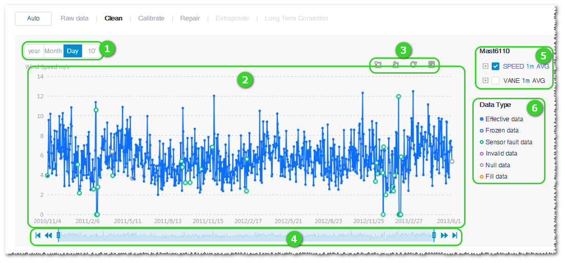
Table 1. Controls and Areas in Data Filtration Interface No. Name Description ① Data granularity options Select the data granularity as year, month, day, or ten minutes. Note: Data filtration must be performed in 10min data.② Time series graph of mast data Display wind speed distribution by time series. ③ Graph scaling and restore Zoom in the graph in a selected area, cancel the zoom in, restore to original, and click  to show the data view of each data point.
④ Time shaft Select the time range of data shown in the graph. Drag the slider to select the time range of data display; click the proceed icon  to switch to the next range of data display; click the back icon
  to switch to the previous range of data display; click
  to switch to the last range of data display; click
  to switch to the first range of data display.
⑤ Sensor channel list Select sensor channels to be displayed in the data graph. You can select more than one channels. ⑥ Legend of data point quality tags Demonstrate different colors of data quality tags. Click the radio button at the center of a tag legend. As you click the data point in the graph, it is tagged as the selected color with its represented data quality.